
It’s time to upgrade your website again…
Today’s websites must go the extra mile to delight users and drive conversions. Developing fully mobile-optimized websites by using a “mobile first” focus as a strategic advantage over the competition. Google wants to delight mobile users. Through a mobile-optimized website strategy you can improve customer engagement and on-page ranking factors. In the process, you benefit from improved search engine optimization (SEO).
Mobile-optimized Checklist:
- You’ve got a website.

- It’s mobile-friendly.
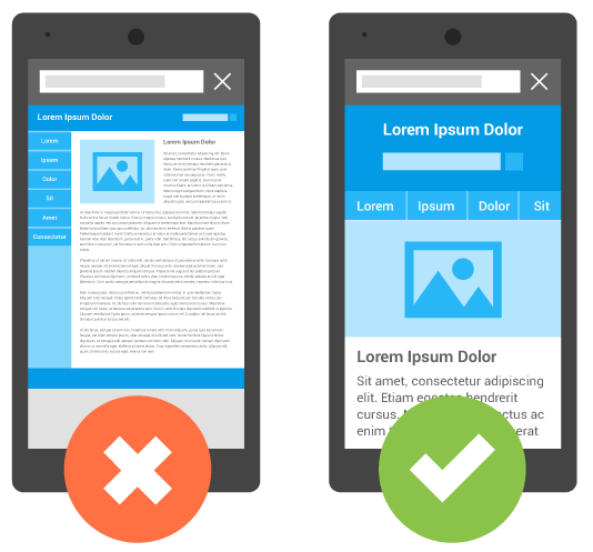
- The mobile content is equivalent to your desktop site.

- The site usability is optimized for touch and text is scaled to proper font size for readability.
- Forms are easy to fill in without scrolling left and right.
- You don’t have to redirect mobile visitors to an m-dot sub-domain to view your site.
This is not good enough in the mobile-optimized world we are racing toward.
Google’s Algorithm
On April 21, 2015, Google released a significant new “mobile-friendly” ranking algorithm designed to give a boost to mobile-friendly pages in Google’s search results. This was the first significant step in Google’s migration to a mobile-first ranking methodology. The change was so significant that the date it happened is sometimes still referred to by a variety of names: mobilegeddon, mobilepocalyse, mopocalypse or mobocalypse.
Then, in November 2016, Google announced their mobile-first index initiative. This means Google will create and rank its search listings based on the mobile version of content, even for listings that are shown to desktop users. As the number of searches happening on mobile surpass desktop, Google wants its index and results to represent most of their users, mobile searchers. Once implemented, mobile-optimized websites will simply rank higher.
Why should your website be mobile-optimized?
Google’s Mobile-First Indexing Initiative
By the end of 2017, Google has announced that they will fully launch this new mobile-first indexing initiative. If you have not mobile-optimized your website to be fully responsive —meaning that you are displaying the same content in a mobile-optimized readable format on mobile devices (smartphones), Google will start penalizing your site’s ranking score. Google will also take into account your site’s page load speed as well as overall mobile design and usability.
Until the mobile-first index change launches, Google has ranked your mobile site based on many signals from your desktop site. That is going to flip, and Google will rank your mobile and desktop sites based on signals they get from crawling your site from a mobile view. Similarly, the page speed of your mobile site will determine the rankings of your mobile site and desktop site in Google. Google will also likely look at title, headers (H1s), structured data, and other tags and content generated from your mobile site. They will use that content instead of your desktop site. Google will rank desktop results based on how it sees your mobile site as the trend toward mobile-optimized search increases.
Mobile Will Rule Search Indexes
Eventually, Google plans to have only one index, based on mobile content, to serve listings for both mobile and desktop users. Many SEO experts agree with SYZYGY 1 Media Group. We expect the timing of this implementation will be sometime in 2018. However, during the initial roll-out period (now through early next year), there will be two indices: desktop-first and mobile-first. A smaller group of users will get results out of the mobile-first index. It’s not something that anyone will be able to control. People will likely have no idea which index they’re actually using.
M-dot Websites are Not Mobile-Optimized Websites
As mentioned earlier, Google currently uses a desktop-first index. The algorithm doesn’t really index your m-dot website or content. It just annotates the m-dot URLs. So, if you did a migration of mobile content from m-dot to your main website now, Google doesn’t have to index anything. It just updates those mobile annotations to indicate a mobile-friendly main website because it is responsive. This is an essential first step from mobile-friendly to mobile-optimized.
If you wait to migrate mobile content until after the mobile-first index roll-out, then Google will fully index your m-dot content and web addresses (URLs). Then, the migration will take longer. This is because Google is not just updating URLs, but also the content and signals within your pages. Google said in a recent “webmaster office hours” video (at the 25:16 mark) that if you are planning at some point to migrate your m-dot domain to a fully responsive website, then you should do it before this mobile-first index goes live.
How do I get started?
If you don’t know if your website is mobile-friendly, take the Google Mobile Friendly Test. If it isn’t, Google is already dropping your ranking score in their algorithm. Websites that are mobile-optimized will display first, regardless of your other SEO efforts.
If you don’t have the expertise or time to “do-it-yourself,” work with properly trained web-design experts that optimize content and functionality for your mobile customers.
Avoid adding content on your site that does not provide mobile visitors a good user experience.
Understand the difference between devices:
- Mobile — Refers to smartphones, such as devices running Android, iOS, or Windows Phone. Mobile browsers are similar to desktop browsers in that they can render a broad set of the HTML5 coding specification, although they have a smaller screen size and in almost all cases a default vertical orientation.
- Tablets — We consider tablets as devices in their own class. Tablets tend to have larger screens, which means that, unless you offer tablet-optimized content, you can assume that users expect to see your site as it would look on a desktop browser rather than on a smartphone browser.
- Multimedia phones — Phones with browsers that are able to render pages coded to meet older XHTML standards, support HTML5 Markup, JavaScript/ECMAscript, but might not support some of the extension APIs in the HTML5 standard. This generally describes the browser in most 3G-ready phones that are not smartphones.
- Feature phones — On these (mostly older or economy) phones, browsers lack the capability to render normal desktop webpages coded using standard HTML. This includes browsers that render only cHTML (iMode), WML, XHTML-MP, etc.
Contact SYZYGY 1 Media Group today!