Your website is an extension of your business brand and must look professional to potential customers.
Let’s take a second to imagine this scenario:
A colleague, friend or maybe a family member referred a potential client / customer to you and your business. It may have come up in a casual conversation. Because you are a friend and your business is a good fit for him, you were recommended. You may have even received a heads up from the referrer to expect this potential client to contact you based on this referral. Excitement about getting this lead fills your thoughts and you are eager to turn this potential client into permanent one, keeping a close eye on your inbox for an email from this “hot lead”. A week later, you have seen nothing from him. No email, No phone call. Nothing…
Or this one:
A potential client / customer performed a Google search, and received a page of search results related to that search. The search lists your business as one of those results. They click the link to your website and your site loads in the potential client’s browser. They look at your site for less than five seconds, then hit the back button to return to the search results. Thirty seconds later they are clicking on a link to your competitor’s website, never, ever to return to your site again.
Why?
Your website scared them away!
What??
Yep, your website just sent them directly to your competition. In the few seconds that you had to capture his attention, you failed. Or more precisely, your website failed. This unfortunate result occurs millions of times a day.
So, what happened?
Your potential client heard great things about you and your business from your friend while talking casually at a business conference. Your friend and this potential client have known each other professionally for years. Since this was a word of mouth referral from someone who was not a stranger, this potential client took the recommendation seriously. What did he do next? He did what most people do before engaging a business and visited your bad website. As soon as he saw it, his opinion of you and your business changed. Because your website was bad, it instantly wiped away all the great things that your friend said about you and your company during that conversation at the business conference. It took him only seconds to form an opinion of you and your business after an extremely brief visit to your bad website.
Common Website Mistakes
There are a number of factors as to why he left your website, but here are a few:
- Your site looks like it was designed by a 6th grader. Yes, that sounds harsh, but there are millions of business websites out there that fall into that category. Having a business website that was constructed by someone who doesn’t know what they are doing causes your visitor to think that since your web designer doesn’t know what he is doing, neither do you! The look of your site is EVERYTHING to your visitor. It either gives or takes away the credibility of your business in the snap of a finger!
- It looks like it was designed in 1997 and not touched since. The copyright date in the footer shows the last site update a decade ago. Would you want to place trust in a business that has ignored it ‘s own website for a decade? Neither would I…
- The website is not responsive, or even considered to be mobile friendly. Aside from the fact that non-responsive websites are penalized in searches by Google, the text on your site was so small that it couldn’t be read on this potential client ‘s phone screen, causing him to leave your site immediately. If you have to pinch and enlarge or scroll left and right on a mobile device to view content, your website hurts your business more than it helps.
- It was built on a free web platform like Weebly, Wix, Squarespace, MoPro, GoDaddy, Yola, etc. Because they are free, these types of websites seem great at first, as there is no cost to get one in place. The cost comes later when you lose a client who thinks to himself, “Why would I want to do business with a company who cares so little about their image that they resorted to using a free web builder for their company website?” Because they are not seen as professionally built, these sites are AWFUL to use for businesses, even very small ones. As consumers become more and more web savvy, they quickly recognize these free websites for what they are. Ask yourself if you want to base your website’s look on template used on hundreds of thousands of other websites?
- No obvious contact information. This one is a no-brainer. If there is not an obvious way for a visitor to your site to engage you via either a phone call or email, that visitor will leave and find an easier company to get in touch with. It’s unbelievable how many businesses overlook this simple thing.
- The website page load was slow. This has happened to everyone. You go to load a website into your browser, and you wait… and wait… and wait…for the site to load. Most people will completely abandon the attempt to connect to your website after about 10 seconds. That visitor doesn’t come back either…
- Superfluous content and other distractions. They look unprofessional and do nothing to help the visitor. Flash animations, sliders, etc. do NOTHING to help your brand. Your visitors want to see clear, concise content and navigation.
- Typos or grammatical errors are the quickest way to be dismissed by a potential client. Don’t let something so easy to fix become the factor that lost you a client.
- Missing or unclear call to action. What do you want your visitor to do? View a gallery of images? Fill out your contact form? Call your phone? Using call to actions properly makes a huge difference in what happens once a visitor lands on your site.
- Cringeworthy stock photos. Stock photos look like stock photos. They don‘t look like people who work at your business. They are used and used and used again to the point that they are instantly recognizable as stock photos. Don’t make this mistake on your website. Using impersonal image content damages the credibility of your business.
Your Solution
Although there are even more factors at play than this, above are the most common issues that send your site visitor packing. Engaging the services of a professional web developer to build out your business site the right way solves all of these problems quickly. Don’t hurt your business by allowing these issues to continue with your website. Visitors want to see clear contact information, a clear and concise description of the business, its offerings and the people behind it. This straightforward approach builds trust in your business and confidence in that potential client to engage your company.
Before / After
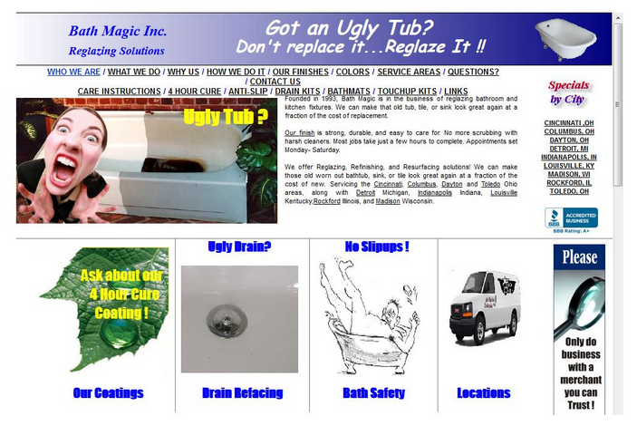
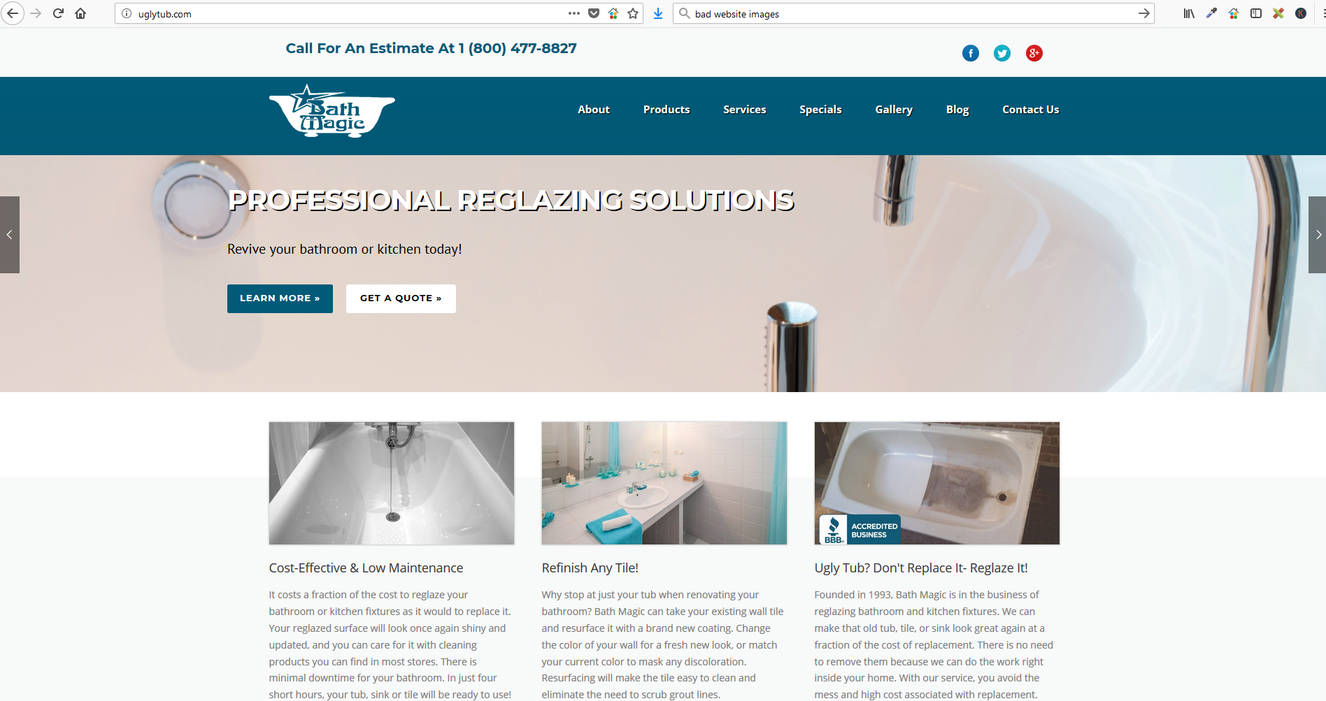
Here is an example of how a simple website rebuild can completely transform a company form one you would never consider calling into one you are confident in contacting and will do the job right. Please remember this business did nothing except have a professional web developer redesign their website. They have made no other changes to their company or the way they do business whatsoever.
This is uglytub.com before…
And now their site looks like this:

Can you imagine the difference in the perception of your business having a really good website will bring? 75% of all consumers use the look of your website as the very first gauge of your business and whether or not they want to do business with you. If 3 out of 4 of your visitors use your website as a first impression, don ‘t you owe it to yourself to make it one that will be positive for both you and your potential client?
If you are ready to take that next step for your company, please contact us.
